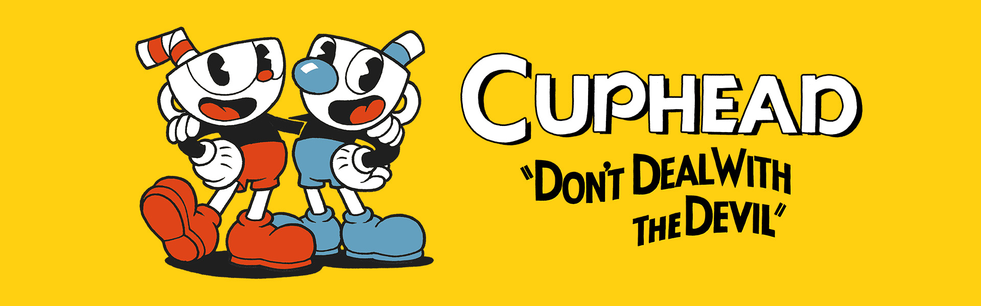
Cuphead is a classic run and gun game developed and published by StudioMDHR Entertainment. The player assumes the role of Cuphead, a character who unwisely makes a deal with the devil. Cuphead must collect the souls of the devil's debtors to retain his own.

The game's controls are simple - move, dash, jump, shoot, and switch weapons - it's the gameplay that's the difficult part. But there are a few places where the game struggles.

So let's begin.

First, there may be some sort of bug (or oversight) on the initial welcome screen. On the bottom, the words "Press Any Button" flash, but *any button* doesn't actually work (A, S, Q, and potentially some others).


After the player starts the game, they are easily able to start a new game or continue. The game clearly shows the controls in the lower right hand corner. Once the player starts a new game, they're treated to a storybook that opens and tells the origin of Cuphead and his friend Mughead.

In the storybook, any key will trigger the page to turn, including the right arrow (which is superimposed on the storybook). Once the story ends, their guardian Elder Kettle gives Cuphead advice. But now, the even though the dialogue has a right arrow on it, the right arrow does not trigger the dialogue to change.


This makes sense - the game's initial control scheme binds the arrow keys for movement, so if a player were to press the arrow key during dialogue, Cuphead would move. But from a user experience perspective, it's weird that every other instance of a key displaying on  a screen (like on the left, Z for exit) will have an effect, except the right arrow key.

The designers could've gotten around this design confusion by mapping the default movement keys to WASD (which I believe is a common control scheme, but I could be completely wrong), and mapping the right arrow as one of the means of advancing dialogue. From a Polygon PSA, it sounds like MDHR could have thought through the control mappings for console and PC a little better.

But even the controls to change the controls were a bit confusing. When I opened up the controls menu, it wasn't immediately apparent how to re-map the buttons (turned out it was use the arrow keys to navigate and press Z or enter to select the box, which in retrospect makes sense). But at first, because I hadn't been in this specific menu before, I wasn't sure what I needed to do. Initially I tried to use my mouse to click (but that didn't work, frustrating but understandable).


Overall, those are my complaints - some buttons don't work, others work strangely. Not many errors to point out in this particular Trials & Errors post. I'm sure there might be some more usability issues further in the game... but it's so challenging that I haven't gotten past the first area. So those will have to wait.

Finally, some recommendations/comments for MDHR.

  • It's a super small detail, but on the initial welcome screen, consider making it such that the "press any button" is true. Currently, certain keys will not trigger the start screen.
  • It would have also been nice to map multiple keys to the same action, just as the game does behind the scenes (both Z and the Enter key will prompt interactions). 
  • Consider setting the default mapping for PC to WASD, and allowing the right arrow to advance the dialogue.
___________

Thanks to my readers! I know it's been a long time since I last wrote (almost a year) - I just needed to take a long break from writing. I have a full-time job in user research (not games user research) and probably too many hobbies, so I didn't have the mental energy to find games to write about (and then actually write about them). But I'm back!

Let me know if you have any game suggestions. The next one up is a second round of feedback on Pokemon Go, which I'm told has changed a lot since I reviewed it last year. Feel free to reach out on Twitter (@keshiekay) if you have any ideas!
Hello, readers.

And long time no chat. I needed to take a long break from Trials & Errors, but I'll be starting it back up again in October. Have any games you'd like me to review? Feel free to provide them in the comments, or on Twitter @keshiekay.

Thanks, and chat soon -
Kelsey


The Elder Scrolls series, by Bethesda Softworks, has been in the gaming scene since 1994. In the past 22 years, the game's graphics and user interface have changed tremendously, from The Elder Scrolls Arena (1994) to The Elder Scrolls Online (2014). This post explores how the interface has changed over time and with new technology.

The first two installments in this series, The Elder Scrolls Arena and The Elder Scrolls II: Daggerfall (1996), were made for MS-DOS only, and featured similar UIs. Both Arena and Daggerfall displayed their main UI on the bottom of the screen, taking up approximately the same space. With the icons in Arena, players could draw/sheathe their weapon, steal, check their status (poisoned and such), access their spells, see their journal, rest, or view a world/local map.

Left, The Elder Scrolls Arena (1994) ; Right, The Elder Scrolls II: Daggerfall (1996)
Daggerfall made a few changes, including adding an 'interact' icon that displayed how the player could interact with the world in front of him/her (talk, observe, pick up objects, steal/unlock). Daggerfall also allowed players to access their inventory by clicking on the money bags icon in the UI or by pressing F6. This was an improvement upon Arena, in which the player could only access their items by clicking on their character's portrait and then navigating to the 'Equipment' sub-menu.

Arena's inventory included all items in a list, and Daggerfall's segmented out item types.

Daggerfall also improved upon inventory management, allowing players to more clearly see which items they had in their inventory and to separate items by type (weapons & Armor, magic items, etc.) Players could view the stat improvements of their items by equipping items and watching the numbers floating next to their characters grow or shrink. The next installment in the series, The Elder Scrolls III: Morrowind (2002), again changed the look and feel of the inventory.

Morrowind inventory window, on top of the map
While Morrowind kept the full-body demonstration of a character's equipment, it removed the floating numbers and the necessity of equipping an item to view its bonuses. Instead, a player could hover her or his mouse over a item to view its stats before deciding whether to equip it. Morrowind also kept Daggerfall's addition of separating out item types (All, Weapons, Apparel, Magic, Misc.)

Morrowind took a very different approach to how it displayed the inventory and other sets of information. Unlike its predecessors, which displayed maps, character sheets, etc. full-screen, Morrowind put all of its information sets in adjustable, windowed boxes. Players could see all of their information sets simultaneously if they so desired. Players could not, however, press a key to open only one of these windows - unless the player had toggled off certain windows, it was all or nothing.

Morrowind also changed the interaction feature significantly, shifting the action from direct (the player presses a button to set whether they're in talk or steal mode) to contextual. In the first few minutes, the player learns she or he can press Spacebar to open doors, talk to NPCs, and pick up items. Instead of requesting player input, Morrowind determined what type of interaction mode the player was in, and changed the effect of the Spacebar accordingly.

The implementation of contextual buttons in Morrowind may not have stemmed from Bethesda's innovation, but instead from necessity and a changing market. The new millennium ushered in an age of console gaming, with the release of the Playstation 2 in 2000 and the XBox in 2001. Morrowind was the first Elder Scrolls game designed for consoles - and contextual, multi-purpose buttons were necessary for console games.

One interesting part of Morrowind's UI design is the difference between the PC and console version.

PC, left; XBox, right

The designs are so different, they almost look like different games. The PC's design was simply not practical on the console, and thus a new design was made. Players could open a specific menu and then toggle between menus with the left and right triggers.

Morrowind's successor, The Elder Scrolls IV: Oblivion (2006), was clearly designed with a console-first perspective.

Oblivion Inventory Example
Oblivion condensed information sets, removing the player's ability to change window sizes and pin information to the screen. Instead, players could access information all in one panel (the "Journal") if they pressed Tab.

The Journal's design - tabs with sub-tabs - lent itself to controller navigation. Console-based players could use the left and right triggers to access the main navigation (resources, items, spells, map), and left stick to navigate the sub-tabs.

Some* PC gamers were frustrated by the change and console-focused design. In Morrowind, their information was one click away - and now they had to navigate multiple menus. Oblivion also had few keybindings for PC menu navigation. While there were technically keybindings to main Journal sections (F1 for character, F2 for items... etc.), there were no bindings available for Journal sub-sections. (*Well, at least one. I found a rant about Morrowind vs. Oblivion I found interesting.)

Oblivion made other changes to the UI as well. The game revived and adapted Arena's item list format into a sortable table and displayed important item information in columns (which previously could only be viewed by hovering the mouse over an item). Placing items in a table format better allowed players to view and compare objects in their inventory.

The Elder Scrolls V: Skyrim (2011) returned fully to lists for its inventory management, much to the chagrin of PC gamers. Skyrim's modding community came to the rescue and created SkyUI, a PC-friendly UI. SkyUI retained Oblivion's sortable table format.

Console version left, PC version right


Skyrim also had logical keybindings for PC gamers: M for map, J for Journal, I for Inventory, versus having players press the function keys. Like in the PC version of Morrowind, players could again access menus separated from the main journal. The PC version of The Elder Scrolls Online (2014) took an approach similar to the SkyUI setup and also increased the number of keybindings a player can use to access information.

In summary, The Elder Scrolls has aged well over 22 years. It has kept true to its action-adventure spirit, and has kept key elements of the HUD in each design. Every release of The Elder Scrolls has shown a player's health/mana/stamina and some navigation method (compass or mini-map) as the basic HUD. Check out how the HUD has evolved over time.

The Elder Scrolls Arena (1994), left; The Elder Scrolls II: Daggerfall (1996), right

The Elder Scrolls III: Morrowind (2002), left; The Elder Scrolls IV: Oblivion (2006), right

The Elder Scrolls V: Skyrim (2011), left; The Elder Scrolls Online (2014), right

With rumors swirling of The Elder Scrolls VI in the next few years, we'll see what kind of UI the future holds.

__________

Thanks for reading! That was a doozy of a post to write, but it was fun to go back in time and see how interfaces have changed over time, and to think about what the design decisions might've been. I was especially surprised to see the stark difference between the PC Morrowind and XBox Morrowind. I also chose not go into detail for ESO or to review Battlespire or Redguard just to keep it brief. Well, relatively brief.

Now if you excuse me, I need to go kill some dragons. I'll see you in the New Year!
And now for a break from our scheduled programming about video games, about something completely different: car accidents. Over the Thanksgiving holiday weekend, my boyfriend and I got into a car accident halfway through our 8 hour drive from Western New York. It was a minor fender bender, where our front bumper swung open like a door and our left headlight got smashed, and their car got a small dent. No one was hurt, and the other car drove away from the accident fine. We coincidentally had the accident right in front of an auto body shop, and the super-nice mechanics shuffled around their full garage to accommodate us, inspected the damage, and implemented some quick-fixes (zip-tying our bumper back on and replacing our headlight and turn signal). We then drove four more hours home in a very unhappy car.

The aftermath on our car. Not too bad.

This post is about part of the experience post-accident. Having never been in an accident before, I wasn't entirely sure what to do, besides call the state police and exchange insurance information with the other driver (although they left before I could get a cell phone number). So I did what any Millennial would do and Google "what to do after a car accident." One of the first things that comes up is call one's car insurance company. 

So I call the 'claims' number on our insurance card (somehow we hadn't received one for 2016, so this one was from 2015)... and I get a message roughly saying "hey answer this survey to enter a drawing to win a free cruise to the Bahamas!" There was no way to skip the survey from the phone options, so I took the survey. The chipper automatic voice then told me I had won, and should press 1 to accept the trip to the Bahamas. Uninterested, confused, and still shaken from the crash, I pressed 2 thinking that would be the 'no, actually bring me to the claims service.' The phone then hung up. I double checked the number on the card, so either the card's number was outdated or printed wrong, or there's actually a survey at the beginning of the insurance company's claim line. If it is actually the case that a survey precedes the claims process on this insurance company's claim line, that is horrendous usability. 

Since the claims number evidently wasn't working, or had bad usability or whatever, I called the customer service line instead. Then I had to patiently wait to listen to all the options, figure out which ones to select, and then wait for someone to answer.

I'm curious whether car insurance companies have done testing to figure out "hmm, which questions do our customers have right after getting into a car accident?" It's entirely possible that they've done such testing for their website or mobile apps - but I'm not going to download a mobile app over 4G just to see if they have a FAQ to see "what to do and what information to get after an accident." At that point, my boyfriend and I were still pretty shaken up. 

And it makes me wonder how much testing has gone into automated phone systems, where you can either state your answer or use the key pad to select a choice. How do the companies come up with the list of options? I just wish there was a line on my insurance card that said "this is the line to call directly after calling the state police/an accident." When I'm upset, I have less cognitive processing power to figure out what "claims" means and what information I will be expected to provide.

Working in the finance industry, the most I've come into contact with designing for human sadness is determining how to delicately design for customers who have recently lost a loved one, and now must transfer assets. Grief is an entirely different emotion than shock, and I'm curious how designers account for creating systems and designs that are easy enough to understand and process even when a user is overwhelmed.

I'm sure there's been lots of design of emergency pamphlets (like in airplanes) and instructions for medical equipment (talking defibrillators) - but what about for situations that are further away from the institutions (in one's personal car - there's no safety officials around to guide you)?

/sigh

Anyways, I think that's the end of my rant for now. I'll resume my regularly scheduled programming next month with more video game usability reviews. If you know any games I should review, please let me know!
From single-key side-scrollers like Canabalt to flight simulators, video games are complex. As such, over time, game designers have created ways to teach users how to control and play their games. Some of these methods require extensive effort on the player's part, like reading a manual, wiki, or having to Google answers undefined keywords. 

Boo. Hiss. (I dislike reading manuals for games)

Other games have tutorials so unobtrusive and integrated that they hardly feel like tutorials at all. Tutorials come in all shapes and sizes and range from being short and subtle to mind-numbingly long and ham-handed. Unless you're a very selective or lucky gamer, you've probably run into at least one frustrating tutorial.

To me, it seems that many players have developed an aversion to tutorials. And some developers, seeing this trend, have either cut their tutorials out completely or skipped steps to shorten the tutorial length. As a usability-specialist, this trend concerns me.

In this blog post, I'll give examples of game tutorials that I found to be particularly good or bad, and explain how learn-ability and usability go hand-in-hand.

Tutorials & Education

In my view, the main goal of a tutorial is to answer these questions:
  1. What should I be doing?
  2. How do I do it?
  3. Why should I do it?
  4. When should I do it?
As others have discussed before me, these questions ought to be answered for each important game element, and the tutorial structured in such a way that concepts build upon each other and information is presented as the player needs it. There are a variety of methods that game designers can use to teach their game, which I won't cover here.

A game that does not answer all of those four questions, or teach important concepts progressively, can be incredibly difficult to learn, let alone master. One game that I've played recently that does not make learning easy is Stellaris.

You're On Your Own, Kid
Stellaris, by Paradox Interactive, is a 4X strategy game which revolves around space exploration, warfare, and diplomacy. As the architect of a grand space empire, there's a lot to learn - how to build ships, research technologies, settle new planets, manage solar systems, and more. It's a shame that Stellaris only teaches you a fraction of what you need to know. 


Although Stellaris has a small tutorial-bot that acts as an adviser in the early game, the tutorial content isn't even close to comprehensive enough to fully learn the game. The main issues with Stellaris' tutorial content are that it doesn't teach information progressively and does not answer the four main questions: what should I be doing, how do I do it, why should I do it, and when should I do it.

Take for example the first tutorial box that Stellaris provides:

Maybe I updated my keybindings, but F5 doesn't show the Situation Log - F3 does.

Once I pressed F5, I saw the following screen (which is NOT the Situation Log! But I didn't know that at the time). And since I wasn't directed to the Situation Log, the bot's next instructions about planets and sectors made no sense to me.


The first time I encountered this disconnect, I remember being very confused: had I clicked the wrong button? Is this the mission list? Because the instruction went to the incorrect place, the tutorial flow was presented to me in the wrong order, disrupting my learning. But let's say that the tutorial had currently instructed me to press F3 instead of F5. I would've seen this instead.


If the player successfully navigates to the Situation Log, s/he will learn the What, How, and some of the Why for Science Ships, but Stellaris doesn't give much direction from there. The tutorial tells the player s/he can select the vessel either by clicking on the ship itself or selecting it in the Outliner (which isn't helpful information at this time, because while the Tutorial Bot is active, the Outliner panel is automatically hidden.) If a player selects a Science Ship as the tutorial suggests, s/he will learn a little more about what Science Ships do... but after that, direct guidance is rare (I believe there's one much later with sectors).

The only way a player learns about the game after the Science Ship lesson is to explore what messages come up when s/he clicks on a unit or a menu. And while, sure, messages like the following Leaders tip are informative, they aren't helpful or educational.


The above tip answers none of the vital tutorial questions: what should I be doing, how do I do it, why should I do it, and when should I do it. (If you're curious, the answers are 1) Assigning leaders to various posts to make your empire more efficient. Each leader gives some kind of bonus or discount; 2)  It makes your society more efficient and has other various bonuses; 3) use this panel and click the 'Recruit' button; 4) Whenever you need a bonus and can spare the Influence to get a Leader.) 

By not encouraging players to click on menus in a certain order and experience the tutorial in a set and organized flow, the tutorial makes the learning experience jarring and incomplete. This is deeply frustrating, because the player may be hours into a game when s/he learns about the ship builder and why it's important and only after her/his fleets have been blasted to smithereens by enemy fleets (or in my case, I didn't realize that I needed a mix of large and small ships in a fleet, I thought I could just have beastly battleships. Oh well.)

Perhaps in an effort to not make players to feel hand-held or babysat, Paradox decided to allow players to move through tutorial tips in a free-form manner - which is not conducive to progressive learning. Stellaris' tutorial flow is like a poorly-structured math class -- it teaches multiplication before addition. Sure, you're still learning basic math, but since addition is the foundation of multiplication, the student can't actually learn what s/he needs to be successful in mathematics.

Stellaris is a fun game, once you get the hang of it, but Paradox Interactive doesn't make the game easy to learn. It's 'Full Tutorial' which I've described here isn't a true tutorial, in my mind - it's a series of fragmented tool tips. And it doesn't work for such a complicated game.


Here, Let Me Help You

Conversely, there's Offworld Trading Company (can you tell I like space-themed games?) which has a very good set of tutorials for players. They separate the tutorials into two sections: Learn to Play and Practice Games.


The Learn to Play games teach concepts progressively, with each tutorial building upon the basics established in Business Building Seminar. The first tutorial teaches you the backbone of building a business: gathering resources for production. It starts off with describing what the cubes represent and look like, and then steadily building upon that knowledge.

One cool thing that this tutorial does is that the 'continue' buttons are important questions that players might not know to ask, but will need answered. That's a clever way of teaching.
After the Tutorial Bot teaches the player what the cubes are, it gives the player an objective of building mines and reveals and illuminates unlocked buildings. As the tutorial progresses, the left bar populates more as the player learns what each building looks like, needs to function, and does for the player.


Although some player may balk at the concept of such a structured tutorial, I love it. The game explain all the information the player needs to know in the ideal order, explaining the what, how, why, and when in an easy-to-learn way. If you're a developer and want to experience a well-done tutorial, I recommend picking up Offworld Trading Company. It's a fun game and a good example.

Deconstructing Rules to Chunks

Now, I'm certainly no expert in learning, but one thing for game designers to consider in their tutorials (because really, you need something, even if it's just one line of text saying 'press X to jump) is how they should structure their lesson. Think of it again as that wonky math-class: you want to teach addition before multiplication.

Before you build a tutorial, you need to be able to answer this question: what game element is the primary foundation of my game? You can think of it like a tech tree: what must the player learn to be able to win the game?

Example of a tech tree (techincally civics, but close enough) from Civ VI

The creators of Offworld Trading Company determined that the most important element in their game is identifying resources. Once the player can identify resources, s/he can learn how to build mines to collect those resources. Once the player knows how to build mines, s/he can learn how to generate electricity and other resources to keep those mining stations running. And so forth.

When building your tutorial, it may be helpful to think of it in that way - if you were to make a tech tree where each element is something the player has to learn, what's the order and structure of the tech tree? It maybe a difficult task to undertake, but a helpful one.

Final Thoughts

All in all, it's tricky to make a tutorial that pleases everyone, as every individual learns differently. But it's very important that you try. As you construct your tutorial, ask feedback from family and friends along the way about whether the structure makes sense, and if they have questions. It'll go a long way.

_________

Sorry for the long wait in between posts! I've been super busy recently, and it's really only been possible to write once a month. Plus, this specific blog post took me two Sundays to write since I kept getting interrupted. Ah, well. Is life. Thanks for reading!